Website Design Case Study | Focus Screen Media
We work with a diverse set of clients crossing the business spectrum from small and local to large and national, but one thing is always at the forefront of our website projects – functional, beautiful web design. We take a look at a website design case study for Focus Screen Media.
Since 2003, we’ve been quietly helping clients realize their business goals by driving traffic and converting leads through websites with improved user experience, updated brand appeal, and impressive designs that create longer engagement and, ultimately, conversions.
Recently, we launched a new site for Focus Screen Media. Focus Screen Media is a pre-screen advertising company that helps small town businesses advertise at local theaters. They work with theaters to bring engaging video advertisements that air before the main showing. While their client-base comes from a small, local territory around a theater, their reach is national and they work with rural theaters spanning the entire United States.
When they came to us, they were looking for two things:
- Improved National Google Presence
- Appealing Design Legitimizing Their Business
Their existing site was a single page site that was never designed to be scalable and lacked the ability for visitors to contact the business for inquiries. You’ll have to use your imagination because I didn’t get a great screen capture of the old site before the images were de-indexed.
I think it makes sense now why they needed a refresh.
After working to create some content and review some layout options, our client opted to go with a simple, yet effective site that accomplishes both original objectives. Here are a few screenshots of the final web design.
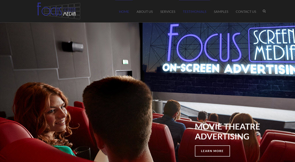
Home Page Header and Slider for Focus Screen Media
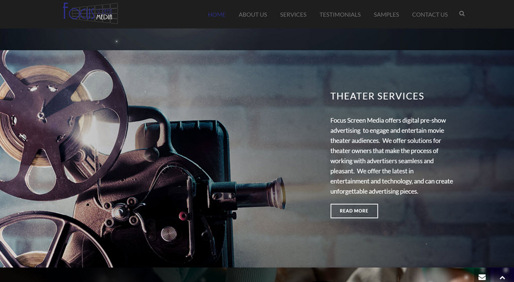
Theater Service Offering from Main Page
Beyond the engaging, updated design, what are the takeaways from a project like this? Well, it’s been several months since the site launched and one of the things we notice are the site visits and overall Google SERP ranking improvements. Here are a few stats to show you what’s under the hood after the website re-launched.
TRAFFIC
Website traffic has improved by a significant margin. In a recent month over month comparison, we saw gains that have helped their site generate traffic nationally as well as locally from both direct and organic searches. Here are the stats:

Month-over-month Visitor Stats
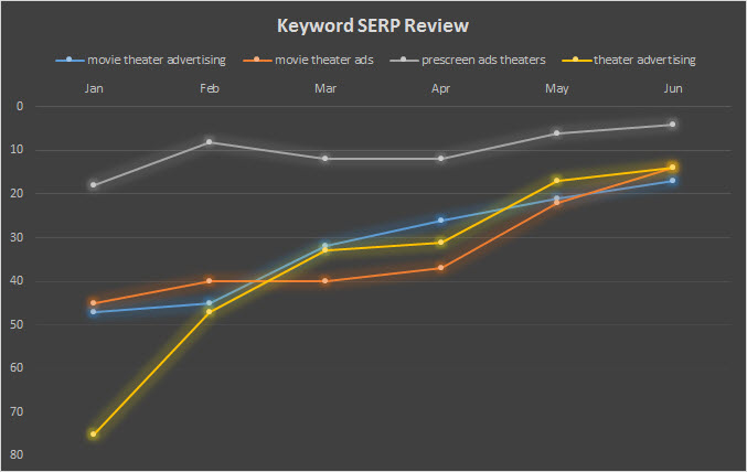
Keyword improvement over 6 months
While we’ve seen measurable improvements in site visitors, we know the most important thing to our customers is increased business. We know that our client has seen an increase in potential client engagement, but they’ve also been able to use the site as a way of creating validity with their business. They can also showcase their advertisements across the country with their now functional video advertising sample area. We use this website design case study to showcase Google traffic improvement and overall SEO performance increases.
We plan to add more sites to website design case study area in the coming months. Come back often to check for more.
About the Author
Ben Lindberg, CR is a partner in Lion Tree Group, a digital marketing agency in Madison, WI. His expertise is in multi-platform brand messaging with a focus on inspiring homeowners. As an industry insider, he has walked the walk and developed a winning business campaign strategy from experience with one of Wisconsin’s largest remodeling companies. His agency specializes in digital design and branding updates. He regularly blogs at his company’s blog: The Bark and Roar.
