Tips for Successful Logo Design
With the transition to digital media, more eyes are watching your brand than ever before. It’s important to have consistent branding to maximize impression utilization. The easiest way to recognize a brand is with a logo.
Below, we go through some common logo design mistakes that you should avoid if you want to create a successful and professional logo.
- Amateur Design

Avoid websites that advertise unreasonably cheap logo packages.
Building a professional logo should be done by a professional. New businesses often invest a lot of time and money in equipment and real estate, but are quick to avoid committing real dollars to define their brand identity. Some common reasons a logo may appear amateurish:
- A business saved money creating a logo themselves
- A printer is enlisted to design a logo – in order to expedite business card and letterhead printing
- You found a website that offered a logo for your business for less than $50.
All of the above reasons can result in image damage to your business or cause and result in delays trying to define your brand and message in the community. Here are a few advantages of hiring a proficient and experienced logo designer:
- Your logo will be unique and memorable
- You won’t run into any problems down the line with using it
- Your logo will have a longer lifespan and won’t need to be redesigned in a couple of years
- Your logo will look professional
- Relying on Today’s Style
 Focusing on a current logo trend is like putting a sell-by date on a logo.
Trends (whether swooshes, glows or vintage) come and go and ultimately turn into clichés. A well-designed logo should be timeless, and this can be achieved by ignoring the latest design tricks and gimmicks.
Logo Online Pros has a great section on its website in which it updates current logo design trends every year. Being aware as a designer of the latest crazes is important, mainly so that you can avoid them at all costs.
- Raster Images – Yikes
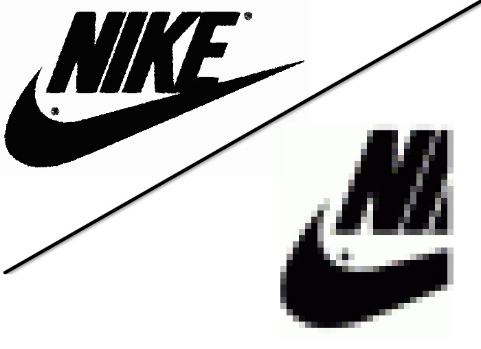
An example of how raster graphics can limit reproduction.
It is a standard practice in logo design to use vector graphics software, like Adobe Illustrator. A vector graphic is made up of mathematically precise points, which ensures visual consistency and scalable sizes. The alternative, of course, is use to raster graphics software, such as Adobe Photoshop. A raster graphic — or bitmap, as it’s commonly called — consists of pixels.
Using raster images for logos is not advisable because it can cause problems with reproduction. While Photoshop is capable of creating very large logos, you never know for sure how large you will have to reproduce your logo at some point. If you zoom in enough on a raster graphic, it will appear pixelated, making it unusable. Maintaining visual consistency by making sure the logo looks the same in all sizes is essential.
The main advantages of vector graphics for logo design are:
- The logo can be scaled to any size without losing quality.
- Editing the logo later on is much easier.
- It can be adapted to other media more easily than a raster image.
- Stock Art
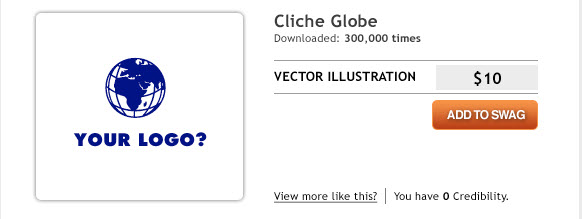 Using stock vector graphics in a logo puts your client at risk.
This is a common mistake made by business owners who design their own logo or by amateur designers who are not clued in to the laws on copyright. Downloading stock vector imagery from websites such as ShutterStock is not a crime, but it could possibly get you in trouble if you incorporate it in a logo.
A logo should be unique and original, and the licensing agreement should be exclusive to the client: using stock art breaks both of these rules. Chances are, if you are using a stock vector image, it is also being used by someone somewhere else in the world, so yours is no longer unique. You can pretty easily spot stock vectors in logos because they are usually familiar shapes, such as globes and silhouettes.
- Designing For Yourself Rather Than The Client
 Never impose your own personality onto a client’s work.
You can often spot this logo design faux pas a mile away; the cause is usually a design’s inflexibility. If you have found a cool new font that you can’t wait to use in a design, well… don’t. Ask yourself if that font is truly appropriate for the business you’re designing for?
Some designers also make the mistake of including a “trademark” in their work. While you should be proud of your work, imposing your personality onto a logo is wrong. Stay focused on the client’s requirements by sticking to the brief.
- Overly Complex

Highly detailed designs don’t scale well when printed or viewed in smaller sizes.
When printed in small sizes, a complex design will lose detail and in some cases will look like a smudge or, worse, a mistake. The more detail a logo has, the more information the viewer has to process. A logo should be memorable, and one of the best ways to make it memorable is to keep things simple. Look at the corporate identities of Nike, McDonald’s and Apple. Each company has a very simple icon that can easily be reproduced at any size.
- Relying On Color Effect

Without color, your great design may lose its identity.
This is a very common mistake. Some designers cannot wait to add color to a design, and some rely on it completely. Choosing color should be your last decision, so starting your work in black and white is best.
Every business owner will need to display their logo in only one color at one time or another, so the designer should test to see whether this would affect the logo’s identity. If you use color to help distinguish certain elements in the design, then the logo will look completely different in one tone.
- Font Failure
 Font choice can make or break a logo.
When it comes to executing a logo, choosing the right font is the most important decision a designer can make. More often than not, a logo fails because of a poor font choice. This could also be referred to as the “Please Not Comic Sans Again” rule.
Finding the perfect font for your design is all about matching the font to the style of the icon. But this can be tricky. If the match is too close, the icon and font will compete with each other for attention; if the complete opposite, then the viewer won’t know where to focus. The key is finding the right balance, somewhere in the middle. Every typeface has a personality. If the font you have chosen does not reflect the icon’s characteristics, then the whole message of the brand will misfire.
Bad fonts are often chosen simply because the decision isn’t taken seriously enough. Some designers simply throw in type as an afterthought.
- Has Too Many Fonts
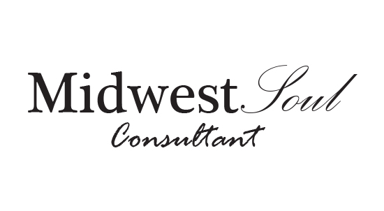 A logo works best with a maximum of two fonts.
Using too many fonts is like trying to show someone a whole photo album at once. Each typeface is different, and the viewer needs time to recognize it. Seeing too many at once causes confusion.
Using a maximum of two fonts of different weights is standard practice. Restricting the number of fonts to this number greatly improves the legibility of a logo design and improves brand recognition.
- Copies Others

This is the biggest logo design mistake of all and, unfortunately, is becoming more and more common. As mentioned, the purpose of a logo is to represent a business. If it looks the same as someone else’s, it has failed in that regard. Copying others does no one any favors, neither the client nor the designer.
About the Author
Ben Lindberg, CR is a partner in Lion Tree Group, a digital marketing agency in Madison, WI. His expertise is in multi-platform brand messaging with a focus on inspiring homeowners. As an industry insider, he has walked the walk and developed a winning business campaign strategy from experience with one of Wisconsin’s largest remodeling companies. His agency specializes in digital design and branding updates. He regularly blogs at his company’s blog: The Bark and Roar.


 Font choice can make or break a logo.


